Messner Bee Farm
Label & Packaging, Marketing Assets
Embracing Previous Designs While Looking Towards the Future
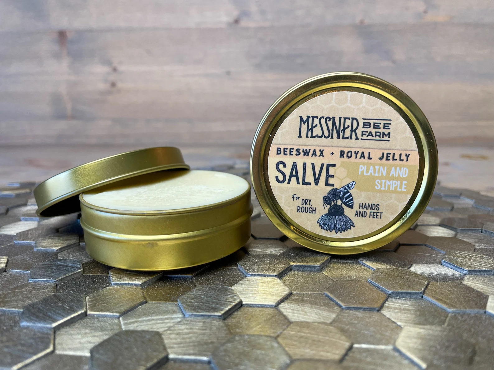
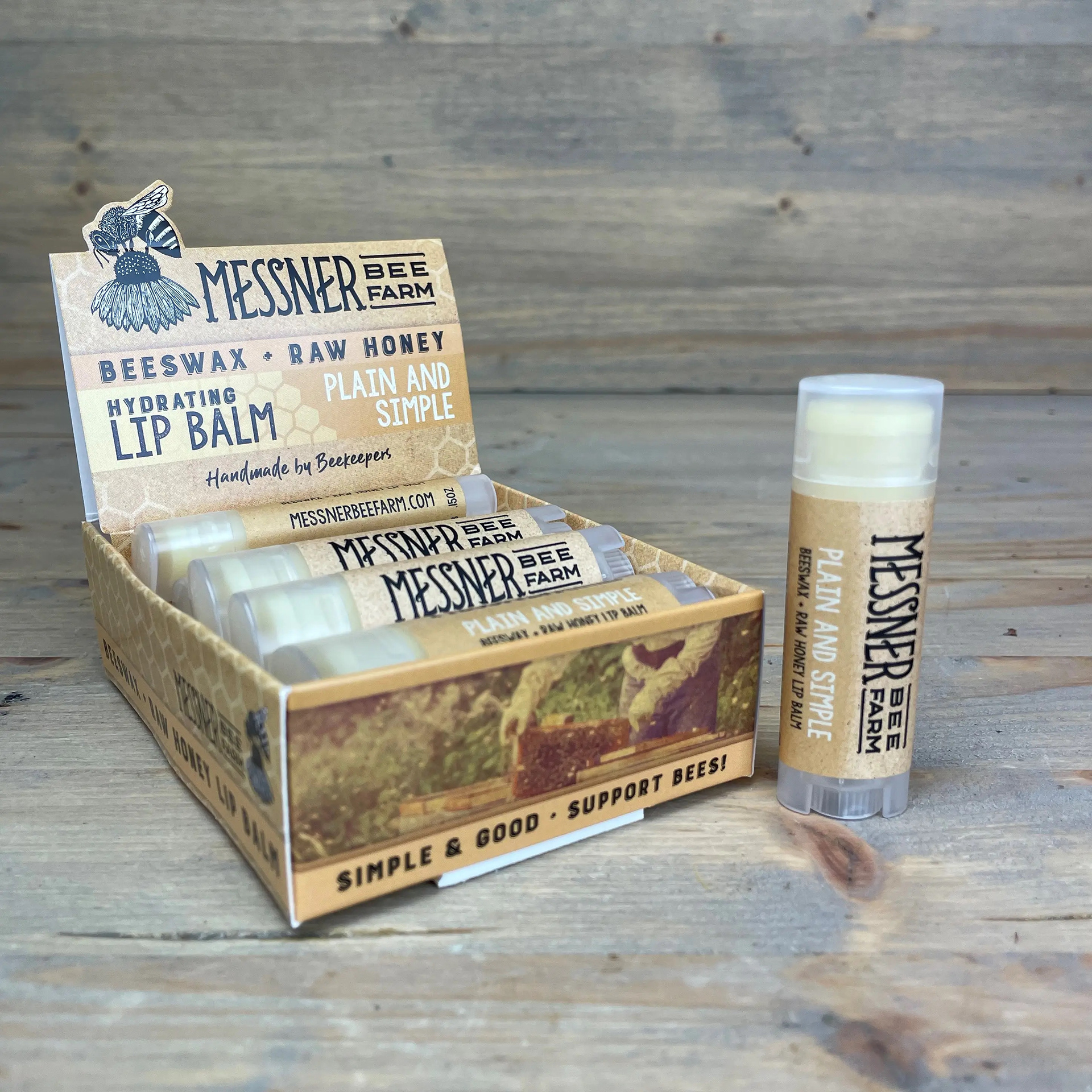
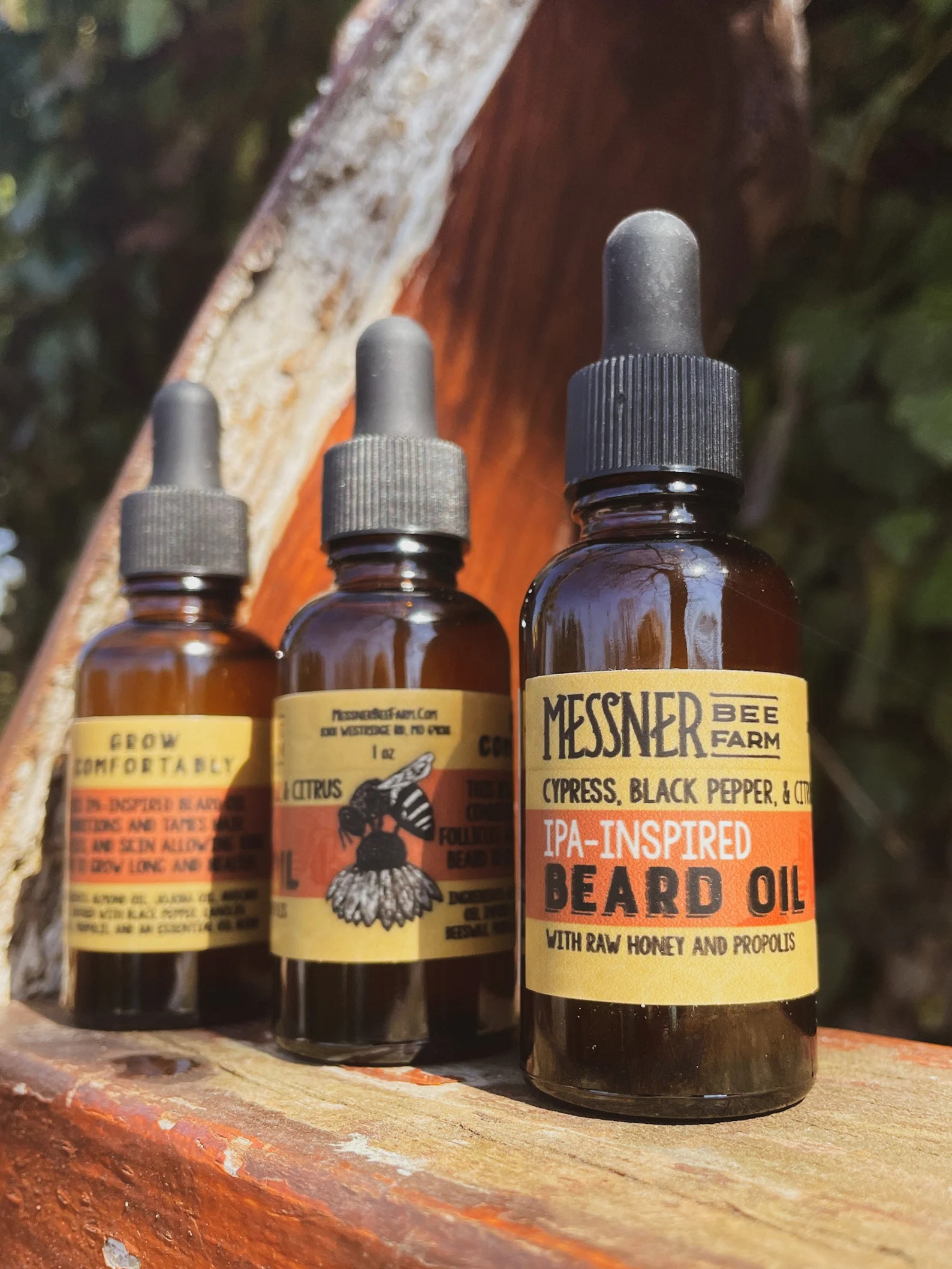
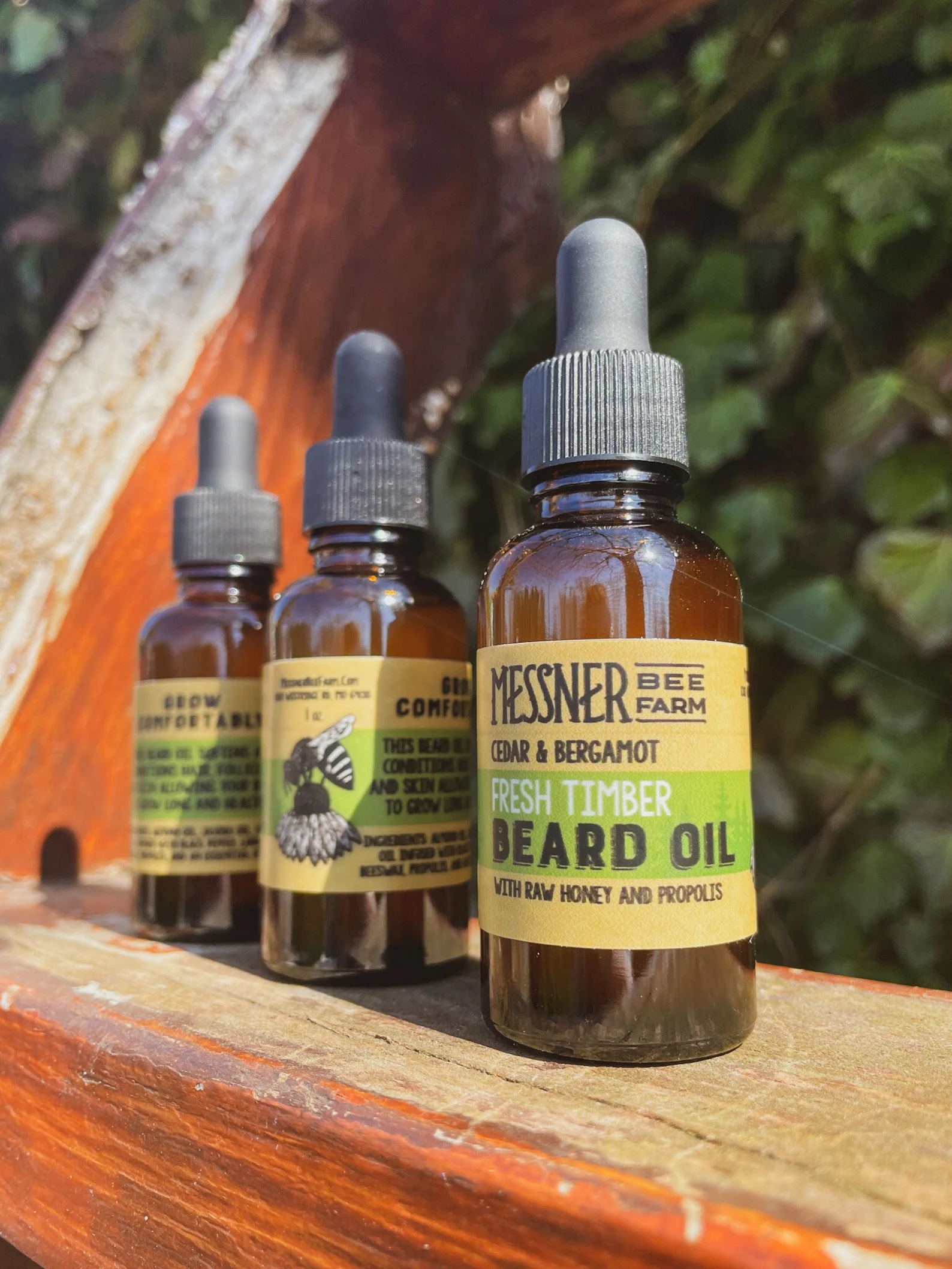
Messner Bee Farm has been a local and online favorite for years. Through tens-of-thousands of sales through Etsy and countless in-person transactions, their products, packaging, and collateral has been seen by a lot of people. Unfortunately, the designs weren't entirely cohesive, weakening their brand presence. So, when I joined the team, I set to work on modernizing and unifying their brand, but I made sure not to lose the core elements of the brand.
Honeycomb, Butcher Paper, Colorful Translucent Flourishes, and Approachable Typefaces
When distilled, these are the visual elements that I felt were essential the brands identity - the things that made Messner Bee Farm, Messner Bee Farm. But these elements needed some refining. A plan was put into place on when and how each of these elements would be used, to help create a strong cohesive identity that would hold it's own on the shelf of any store.


Photo Credit: Messner Bee Farm